

![]()
Have you noticed how the symbol for 11 (2 bars and a dot) looks very similar to the Soma Ranch Logo? It’s a cool story; When we were creating the name, image and branding for Soma Ranch, my web designer requested I NOT be involved in the development. Instead he requested after the initial decision that Soma Ranch was the name and a few details like we wanted the ranch to be green, full of heart, balanced, vibrant, welcoming and fun.
6 weeks later the web site was presented. I exclaimed “why did you put symbol 11 in the logo?” The web designer) replied “what’s that?”
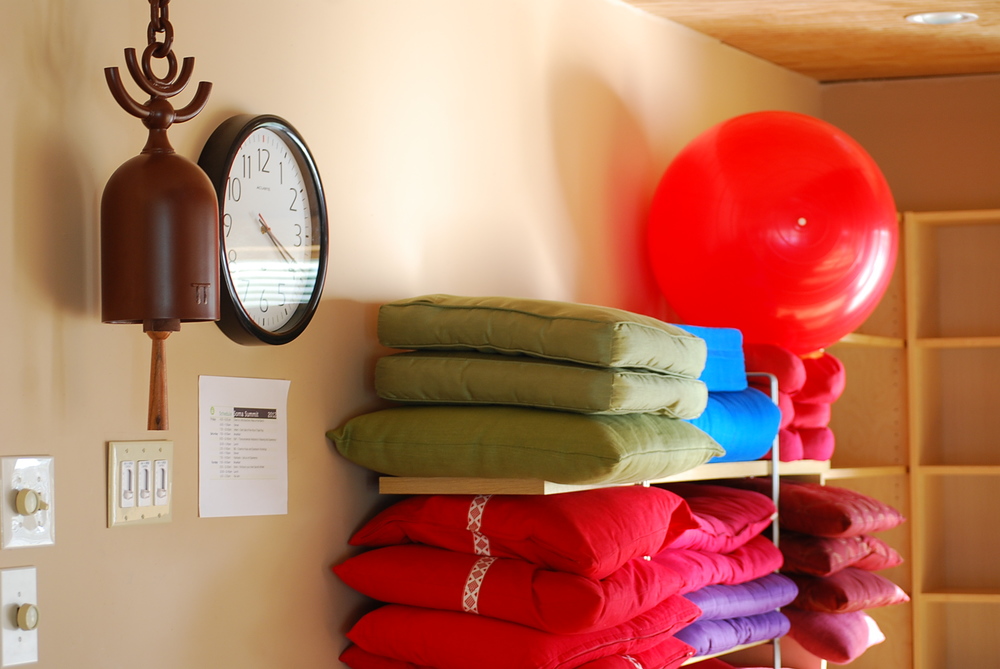
Jean Marie and Elaine (super duo designers) developed the logo from our studio bell. I love the shape of the bell. Look how it’s like someone dancing for joy (head, arms and legs), leaping over the “skirt” of the bell.
The logo represents
- the head (dot) arms (first bar) and legs (second bar)
- Soma “of the Body”
The dot + 2 bars represents
- Joe, Helen and our daughter, Liliana = a small family business
- my faith (Christian): the Father, the Son and the Holy Spirit.
The logo reflects
- symmetry with 2 lines and 2 circles (one small inside, one big outside)
- my love for simple, clean, Zen design.
- 2 circles (small and big) represent yin and yang.
The color green
- represents our ranch (green, nature, do our best to recycle, reuse etc)
- radiates the heart chakra (we have our heart and souls in this business)
- happens to be Helen’s favorite color and the color of her eyes (personal)
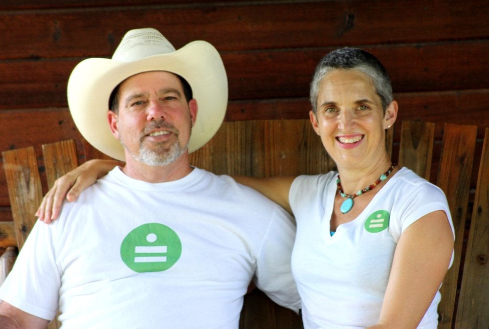
The amazing design duo didn’t know 2 bars + a dot = 11. They didn’t intentionally select the number 11 to be the logo.
Principle #11 in the Nia White belt is “Creating a Sacred Livelihood”
Joe and I feel Soma Ranch is a physical manifestation of how we have created our sacred livelihood together.
How perfectly magical our logo is all of the above.
We LOVE it - and hope you do too.